Custom Logo Design Services in USA
Pixels Logo Design is a full-service digital agency based out of Walnut, California. It offers branding and digital marketing solutions to thousands of brands globally.
|
In this highly competitive marketplace where brands are arising from everywhere, your brand’s logo is something that is going to set you apart and create the right impression of your brand. However, getting a logo design can be an arduous task which requires great creativity and diligence. Design companies are coming up with new perspectives all the time to satisfy their customers. Some of the latest trends are: Minimalism This is about keeping it simple. All the essentials are retained while removing the unnecessary details and colors. It’s about keeping the logo smart and idiosyncratic which can be used across different formats. Instagram has recently recreated its logo using this technique. 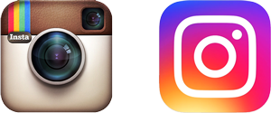 Text logos A classic text logo should be your top choice if you are having trouble deciding on a design. Different fonts can be paired with colors and nominal effects to create an aesthetically pleasing logo. Sony has used a text based logo design since its inception.  Letter stacking By using succinate text in a large message makes the design more appealing. Text can be placed in any manner that appears pleasing to the eye. This lets the consumers focus on the text while having that overall aura of the logo design in their head. It’s one of the most popular technique used these days.  Lettering This trend makes elegant looking logos. It can be argued that it’s not one of the most ingenious style of design, still it remains popular among the recent trends. Most of the cafés and restaurants use this style in their identity. An advantage of using lettering is that it has very few limitations. On the other hand it can really test your creativity as it is very easy to mess up if you go into too many complications.  Line art This one is one of my favorites. It is rather a sub form of minimalism. Using dark lines, images and text together to form a meaningful logo design is the essence of line art. Most beautiful and artistic identities are designed using line art. 
2 Comments
The written word is one of the mankind’s most impactful and remarkable inventions. For over 4000 years, its fundamental communicative purpose has not changed. However, the way written communication is authored and presented has never stopped evolving. You’ve often heard the phrase, “his words were very animated.” A metaphoric term for a speech made with much enthusiasm and vigor. The metaphor, however, will transpire differently when you put it to a literal yardstick.  In a world of graphics, animated words change their color, size, and position over a defined length of time. The purpose is your eyeballs. Increased size may indicate greater importance, and changeable color may attract attention to the details. This transmutation also subconsciously changes our perception of that word.  The technical term for this form of artistry is kinetic typography and can be an excellent cog in your content marketing strategy since the motive of your content marketing efforts is to alter or enhance your target audience’s behavior. You can use it to express emotion in text-based interpersonal communication. There are two ways to do it,
Simply put, when used smartly, animated words speak for themselves. They become the kind of storyteller that can move your audience emotionally.  Research conducted at a Pennsylvania University tested people’s reactions to four separate animations of the message ‘I am fine.' Each one of the four animations was designed to appeal to a different emotion: joy, happiness, sadness or anger. The results are very extremely revealing. Although the words themselves were neutral, viewers experienced the expected emotion with each animation.
In the glitzy world of Hollywood, animated words made their proper debut in Alfred Hitchcock's classic North by Northwest (1959). The movie’s opening title sequence had credits that flew in from off-screen, and swiftly faded out into the film. Since then, text animation is used heavily in the movies, television, and advertising.  Image Credits: BREWINGLABS.COM A brand or a corporation is recognized by its logo, vision and mission, brand values etc. Amongst these, a corporate identity logo is defined as a mark, symbol or signature that not only identifies a company, but also differentiates it from competitors. To put in simple words, a logo helps identify a company through a visual an individual will recognize tin the first instance without the name of the brand mentioned somewhere. Designing a corporate identity logo is part of the branding process. An effective corporate identity logo plays a critical role in making brands successful. This only happens if the logo is well designed and according to the brand’s positioning. It tones, colors, illustration style and most importantly its emotional and functional message, all of which are used for the purpose of communicating the brand’s essence to its target audience instantly.  Image Credits: WALLZOA.COM
To design an effective design for a brand, the logo must be simple, timeless, appropriate and versatile and eye catching so that it grabs the attention of the viewer’s promptly. A simple design of a corporate identity logo enables quick and easy recognition of a brand. Following the principle of keeping the logo simple, the logo should be that it is easily recognized. A logo should be versatile and attractive enough that it works effectively across different applications and mediums. Last, but not the least, positioning of the brand logo should to appropriate in terms of brand business or purpose. For example, if you are developing a logo for a children clothing store, then the logo should be full of different colors, fonts, and childless schemes and styles. |
AuthorPixels Logo Design is a digital marketing agency based in California that offers branding solutions for small and large businesses worldwide. Founded in 2006, Archives
March 2017
Categories |
 RSS Feed
