Custom Logo Design Services in USA
Pixels Logo Design is a full-service digital agency based out of Walnut, California. It offers branding and digital marketing solutions to thousands of brands globally.
|
What comes to your mind when you think about a relaxing vacation? A beach? Do you envision yourself reading a book and sipping a drink while swinging in a hammock? I bet the vision of your perfect vacation involves a luxurious hotel, a comfortable bed with plush and fluffy pillows and heavenly covers you can cuddle under? If you travel often, we are sure you must have a favorite hotel that you love going to? Where you feel safe? If you are in the line of business that requires a lot of traveling, we can sure relate to the relief you must feel when your hotel’s airport staff receives you at the airport welcoming you. By the moment you see your name on a paging board with your hotel’s logo design on it, you can be certain that you will be taken care of. All worries just disappear when you come across your hotel brand and that’s what an ideal hotel brand should be and a hotel logo design should be a reminder of the comfort that comes along.
Whenever you think of a vacation or a business trip, does the hotel logo design of your favorite hotel pop up in your mind? If yes, then that’s what powerful branding does for your hotel. Your hotel logo design should be easily identifiable and stimulating enough for you to want to pull over and spend a night or dine there. Big hospitality brands like Sheraton, Westin, and Hilton etc. are just some of the logos that are etched in your brain as the trusted symbols of comfort, warmth, and security. If you see these hotels, you won’t think twice about staying there because you know that it is a secure place to stay with your friends and family. The hotel logo design itself conveys the message “the safe place to stay” and that is what makes you choose these hotels over any other. The credit goes to their outstanding graphic design team for making a logo so sticky that it resonates with their target audience. You need to create a hotel brand that speaks to your audience and communicates that this hotel is a great place to sit back, relax and enjoy. One thing about hotel customers is that they love to brag about it and that’s one area where your hotel brand can really benefit. Your customers can tell all their family and buddies about your hotel and what a great time they are having at your hotel which makes for really good word-of-mouth marketing. Get a hotel logo design and a name that sticks with your target customers.
0 Comments
A dynamic brand has the quality of all – It has the potential to evoke feelings of trust, it is a brand representative, it is a lead generator, it is a story teller – It is everything all at once. Here are a few important design rules that need to be applied to your logo creation process. These tips are fetched from Creative blog's Logo Design: pro tips:
A logo needs to be simple: The simpler your logo design is the easier it is for your audience to recognize and understand your message. One of the best logos of the world is found to have the simplest of designs. Same goes for its font, color choice, graphics and images. Best logo designs have maximum of 2 to 3 colors in them, where as a single font does the job if you logo has a brand name in it. It has to be Memorable: Any artwork can have a design that impresses its audience. But for a logo design that has the quality of being memorable and impressive at the same time is what makes your brand a winner. It should have a long life: Go with a strategy that makes your logo creation process “future proof”. Think big, let your design be a representation of what you plan to become 10 years down the line not what you are at present. Versatility is necessary: A proficient logo design has the quality of being flexible, one that can work well with all the mediums and applications. It should be appropriate: For a logo design to reach its target market, It must have an appropriate design and message. All this requires to have a good sense of focus on what you really want a logo to look and who should it cater to. If you know what your audience want and expects from you will be able to develop a logo design that cater to them well. Your brand can be a spectacular one too if you follow the above mentioned tips and make it a focus for your logo creation process. And it’s okay to take inspiration from the outside as logo as your logo is a just a refined and unique concept that differentiates you from your competition. Your business logo is one thing that you absolutely can’t get wrong. Since it singlehandedly has the responsibility to represent your brand, you need to select an emblem that’s perfectly in line with your brand values. However, the situation is ten times more crucial if the business is re-branding itself. Us consumers are generally not very crazy about change, we don’t accept changes that well, especially when it comes to our favorite brands. In the world where everything is changing so quickly, we want our favorites to remain a constant and we absolutely reject any changes to them unless they have really outdone themselves. Today we look back on some of these corporate logos that re-branded themselves by changing their business logo in the past year: 1. Lenovo: Lenovo is a Chinese tech company that changed its business logo. The new corporate logo is meant to communicate a brand that spans different categories and never stands still, however, the new logo was not well received by the consumers with many calling the logo boring. 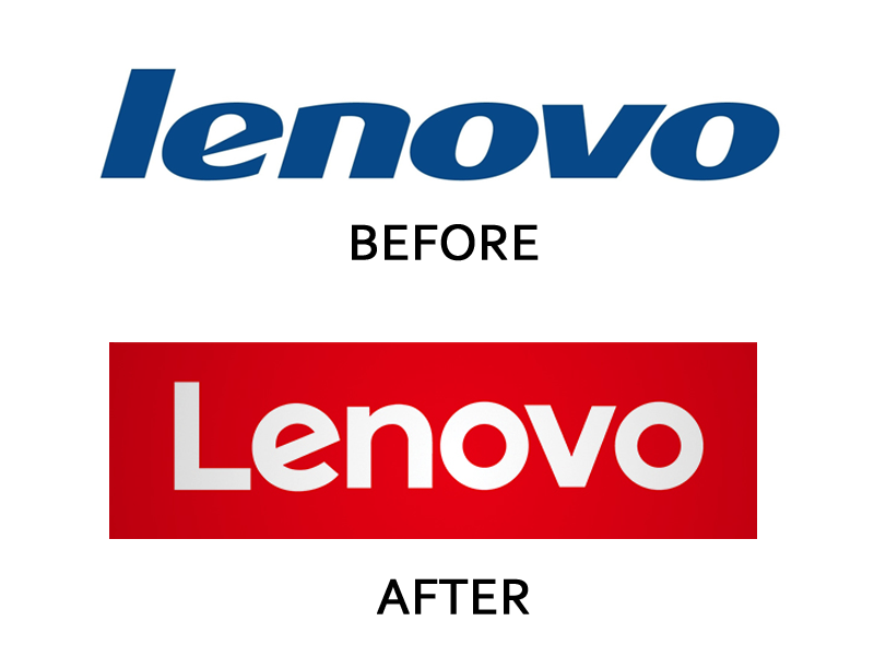 2. Verizon: Verizon introduced its new corporate logo after it acquired AOL however neither the design community nor the customers were very receptive towards the new logo with many calling it “Basic”. The signature red checkmark which has become synonymous with Verizon’s brand has been de-emphasized and pushed in the corner in the new design. The straighter font choice made the customers feel as if the brand has lost its spark. 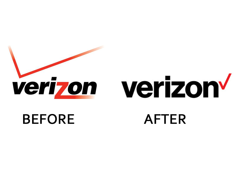 3. Merck Pharma: Merck has the title of being the oldest pharmaceutical company in the world. However, its new logo shocked everyone as it doesn’t sit well with their brand image. It is an almost cartoonish looking logotype logo which seems to be filled with green slimy color. One thing is for certain, though, this definitely doesn’t look like the logo of an oldest pharmaceutical company. It looks more like a children’s video game logo. 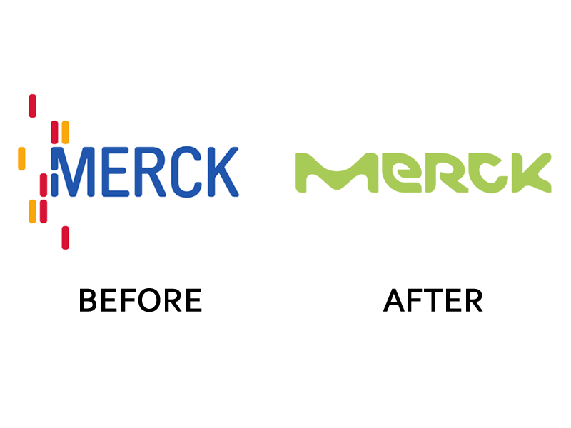 4. Daimler: Daimler is the parent company of Mercedes which recently updated its look which has received mixed reactions from its audience. The new logo has a metallic tinge that looks a little cheap than classy. 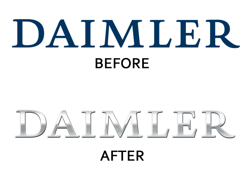 These are some of the worst business logo fails of 2015. Read and take note to avoid making mistakes that these brands made while re-branding.
Designing a logo is a simple task right? Think again. A business logo design has so much more to it. You can’t just type your brand’s name on art software and outline it with square design and call it a logo. A business logo has a well thought out figure that is then used to impact a customer’s brand perception, purchase decisions and their behavior towards a certain service or product. We begin to realize all the techniques, strategies and investments place behind a business logo design once we start working on one.
We live in a world where brands are recognized by their logos. We are surrounded by a numerous of business logos that keeps telling us about their advantages and fight for attention. In this modern era, for a business to be successful you must first place a considerate amount of attention on your logo designing process. No wonder good graphic designers are in high demand today and it’s for a good reason – A logo is your brand’s first impression, it plays a vital role in achieving your customer’s confidence and trust in what you are planning to offer to them. However, billions of brands today have their focus on developing their brands and almost everyone knows how important it is to have a logo that does all the success talk. Competing with industry giants can be very difficult but it certainly isn’t impossible. To make a difference you must base your designs on originality to produce end results that are memorable and wins audience emotions instantly. It’s all about mind games. According to a consumer psychological research, Logos elements play a vital role in impacting consumer behavior and helps develop certain emotions that build an instant connection of brands with them. That’s right. Logo elements such as fonts, colors, images, size, and shapes give your brand name a meaning and can help you design a corporate message that is perceived by a viewer. But at the end of the day it all comes on the kind of designer you choose to design your business logo. Make sure to select one that is professional and has worked with a company similar to yours.  We all got pet peeves. I have a few of those myself like People that chew with their mouth open, the ones that tell you to calm down when you are angry, the ones that say the word “literally” in literally every sentence. Let me tell you all a little something, no one in the world history has ever calmed down by being told to calm down so just quit it! However, there are always these little things that drive you over the edge and make you pretty angry. Today we are discussing the pet peeves of graphic designers. Graphic Designers are usually very strong people, they are like sponges, they absorb all the criticism, rudeness, harsh comments, unbelievable client demands and still pull off an amazing design but there are some things that drive these nice souls over the edge as well. So here is a rundown of graphic designer’s pet peeves as told by designers themselves:
1. Comic Sans MS: This single font has the power to annoy the entire graphic designer community. I mean if it is used on a birthday party flyer made by a 5-year-old, I’d understand but this font is definitely not meant to be used for professional communication. You cannot use it for doctor’s office sign nor for a website. It gives an amateur childish look; only go for it if unprofessional is the look you are going for. In fact, even then don’t go for it! 2. The Loner: The one word that gets left behind all alone in the whole line is what I refer to as the loner. Not only does this loner look alone and sad, it also disrupts the reading process. Only a single word eating up an entire line of space draws unnecessary attention. Graphic designers always adjust the layout and text to avoid such loners. 3. Curlz MT: Again, a font good for a 13year old’s Bar Mitzvah invitation but otherwise? Not so much! It is annoying, hard to read and unprofessional. Hopefully, they are enough reasons for you to not go for it! 4. Whitespace: I sincerely believe that Whitespace is not given enough credit, one that it definitely deserves. I personally hate the ads where there is no space for the words to breathe. Everything is so cluttered and so much information that your eye has no idea where to look. Use the whitespace wisely to communicate your message. It’s hard to maintain your focus on one thing when you’ve got so many things going on. 5. Mom/Friend/Niece/Nephew/Dog said: Everyone likes to get feedback from their loved ones, graphic designers understand that but it gets annoying when that feedback turns into a lesson for the designer. You didn’t hire your mom/friend/sister etc. to design for you. You contacted a professional graphic designer so trust in our ability to deliver a design that would wow you. If you are guilty of any of the above, don’t worry! It’s perfectly fine. After all, it’s all about personal expression. Design what looks best to you! Don’t Let Those Sales Slip Away! Steer Clear of these E-Commerce Website Customer Turnoffs!9/7/2016 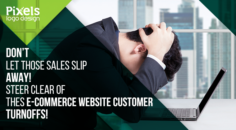 You’ve set up your online store. You have spent a lot of time, money and efforts on your marketing campaign, you have a lot of website visitors but those visitors don’t seem to be converting into paying customers. People abandon their carts midway and you fail to understand why that’s happening. Allow us to shed some light on the subject. According to one statistic, about 67% of the customers abandon their shopping carts midway and there are definitely some triggers that fuel this abandonment. We are enlisting some of the most common customer turnoffs so read on and if you see your e-commerce website business guilty of any of the below, we suggest you stop immediately!
1. Not having a Mobile Website: The majority of traffic comes from mobile devices so don’t risk losing business by not having a responsive website. Nothing is more cringe-worthy than having to zoom in and out on a page to see it properly. If your e-commerce website doesn’t adjust to my device and my browser, I am switching tabs! 2. No Customer Service: People are really impatient these days. They want their questions to be answered right away and if they don’t get immediate assistance on your e-commerce website, they’ll go the site where they will. For instance, what if you walk into a store and there is no sales staff, no customer service representative to help you out or to answer any questions that you may have. Would you buy from that store? Of course not! That’s exactly the case with online stores. Make sure that you have a number that's reachable, live chat support or other channels to answer your customer’s queries as soon as possible. 3. Pre-Registration: Asking your customer to register and provide their information when they have not even done business with you frustrates them the most. Why are you asking for this information? Because you want their email address so you can send in promotional emails and newsletters. You know it, we know it and they know it too! It does no good for your or your business and only causes resentment. 4. Poor Quality of Photos: Now this one is so obvious. Having the product photos up in poor quality when you are running an e-commerce website store is basically signing yourself up for failure. Your customers aren’t seeing the things in person, the only thing they can see are photos and bad quality photos are a major turn off for any customer. 5. Hidden Shipping Costs: Some online stores surprise their customers with hidden shipping costs and may I tell you this surprise is never pleasant. No one likes to read free shipping only to have unexpected shipping costs listed later when they hit confirm order button. According to one statistic, 34% of the customers abandon their purchase midway because of unexpected shipping charges are shown later in the checkout process. In the end, it’s all about delivering a great customer experience. Just bear in mind to not do anything you wouldn’t want to experience if you are making an online purchase on an e-commerce website. |
AuthorPixels Logo Design is a digital marketing agency based in California that offers branding solutions for small and large businesses worldwide. Founded in 2006, Archives
March 2017
Categories |
 RSS Feed
