Custom Logo Design Services in USA
Pixels Logo Design is a full-service digital agency based out of Walnut, California. It offers branding and digital marketing solutions to thousands of brands globally.
|
A design that which corresponds with its target audience within a few seconds is the final goal any designer would be happy with. What makes a car logo design memorable and a remarkable success? Originality would be key, while the Image and its correlation with the goals and vision of the organization would have a significant impact. Bottom line being if the logo looks good in black and white then it is a success in itself without typography and content. But how does a designer influence himself for such a design and then maintain unique balance with exclusive colors and fonts. The current trends for a communicative logo is to use about 2 colors and a customized font to add exclusivity to the complete image. Negative Space Collision Most design trends as of 2016 have shown effective use of Negative Spacing, thus not only bringing about a unique change in the world of logos, but also customizing font to the extent where the complete identity could be used in different color backgrounds – while maintaining customized font and its color as it is. A number of other variations can be utilized to bring this in to effect, nevertheless, negative space has its own natural effect especially on banners, business cards, applications and website designs. When customizing a certain font with Negative Spacing especially for a Car Logo Design, the most beneficial factor would be the use of only 2 colors. So far, Black & White, Red & Black, Fluorescent Green & Black have all been able to yield successful results for giant automotive organizations. Fonts Coverage The number of automobile images we see today are all pertaining to the manufacturer’s history, unique to its originality and coherent to the values of an organization. Automotive Giants like Ferrari, Jaguar and Ford tend to display animals for strength, agility and style. Fonts incorporated within the animal figures itself, with customization may also yield a productive and memorable car logo design- what matters the most is the stylized look and feel of the complete font inclusive of the trademark
0 Comments
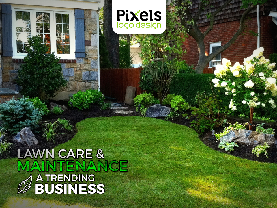 Finding peace in home is one of the best feelings one can experience. Building beautiful and alluring landscapes in homes to get that serenity and peace you travel the world for is the new “it” in the industry. Many landscaping and lawn care businesses have emerged in the past few years coping with the increasing demand for beauty and greenery. Establishing a mesmerizing view of landscape in houses and at commercial locations is the new buzz – People are spending to feed their passion of gardening and to impress. New and existing Landscaping organizations have realized the importance of having a distinguished brand to win customers. In this chaos and fight to win customers a brand must have a successful landscaping logo design that steals the spot light from your competitors with accomplishment.
Successful brands have logos that speak for their services and promises clear and loud. All the organizations aspects combined with significant brand elements make for a perfect logo. The first elements that come in mind when thinking of a landscaping logo designs are Grass, water and leaves. And this short list of elements is enough for an experienced logo designer to nail it. With only so much of elements they come up with a myriad logo design that leaves an everlasting impression on the viewers. For landscaping business it very important to weave the right message and imprints in the Landscaping logo designs to attract the right clientele. Are you serving commercial clients? Residential? Are your targeted segments involving upscale or middle income clients for your lawn care services? Pulling off a landscaping ‘character’ can work too sometimes. Surely green is in. Imprints of leaves work well in the industry too but how do you make a difference? The secret lies in the accurate use of colors, fonts, artwork and themes - Each of these elements are potent enough to make or break the plan. A wise step would be to hire a professional logo designer that knows how to incorporate all the elements in your landscaping logo design that not just captivates the viewer’s mind but compels them to give your service a try! A unique image to display either strength, energy or fitness in order to grasp the attention of the masses for better health and happy lives. Each Fitness House has but one goal, more clients and increased repute. Knowing that the logo would do most of the talking especially for a startup, the organization would turn to a professional designer to formulate an engaging, everlasting and a highly cor-responsive and not to forget ‘competent’ logo. The vision of a Physical Fitness Logo Design would either be a 100% genuine or 20% influence, nevertheless the goal would be to portray one such specialty within the complete logo to remain competitive and boost clientele.
Images Used Most images would depict a barbell, dumbbell, a male or female torso with a dumbbell. However for those few who tend to image the complete logo in black and white with a hint of the gym equipment would definitely entice the curiosity cortex within the human brain. Out of the world’s top ten Physical Fitness Logo Designs, most tend to instill the image of an animal to display strength, like a pit-bull dead lifting , how does this help? Well it actually does, apparently it increases confidence, the aggression to work out for immediate results and hence an image within the complete logo can be beneficial, based on how communicative it is. A simple display of a barbell can also yield results, or simple and easily decipherable font could also generate clientele, but the use of intelligent colors would truly pump the potential of the complete logo. Typography – Color – Diverse For a Physical Fitness Logo Design, maintaining only 2 colors throughout the logo would definitely help as it wouldn’t deviate from the goals and visions but instead only increase repute and class of the overall image. On the other hand, the font utilized would constitute to the number of clients you would want at your organization. If the font is a mixture then it wouldn’t gain attention, instead it would only lose focus and repute for the organization. Hence it is significant to use the same font throughout the logo that which can be perceived off a business card, a website or even a billboard banner. Sans Serif, Calibri (Body), Cooper Black and Cooper Standard Black can also be helpful to correspond effectively as long as its intelligent use, displays a Physical Fitness Logo Design with either thick or thin brush strokes for transparent perception.  With great technological advancements, scientists and researchers around the global are striving to achieve innovative methods and effective cures to the emerging diseases among-st people. Ensuring health & safety for a longer life and relief from diseases has always been the primary concern for everyone and when they seek a professional’s help for a cure, they look for a promise - A promise that they will live longer. Your Pharmaceutical Company should be able to deliver these promising words evidently. Beyond doubt, a remarkable Medical and Pharmaceutical logo design is a mirror image of its trustworthiness, reliability, exceptional patient care and most definitely, hopes! As William Osler words his opinion:
“Medicine is a science of uncertainty and an art of probability”. – William Osler Your pharmaceutical company is more than just a center for patient care; it is where sick people come for hope. Whether it is a renowned hospital, medical office, clinic, healthcare business, pharmaceutical brand, or drug company, your brand image should be able to gain people’s trust and the best way to do it is by designing a medical and pharmaceutical logo design that accurately depicts your intentions. The design of medical and pharmaceutical logo should be able to express what you have to offer for the masses. It requires precise fonts, colors and themes that are simple, yet self-explanatory. Each color has its own characteristics that associate them with certain feelings or memories. For example, red is the color of danger or alarm whereas blue has a soothing and calming effect on mind. These factors play a vital role in creating a distinctive image for your specialization – just like a logo of an optician clinic will differ from that of a dentist’s – Based on the specializations a medical and pharmaceutical logo is shaped wisely ensuring that it evokes a feeling of faith and assurance. A compelling logo design will always gain confidence and leave an everlasting impression on the masses; provoking them to rely on your brand for your extraordinary health care products and services. A traffic boosting Medical and Pharmaceutical logo design takes a permanent place in the people’s memory and makes them come back to you, for they have faith in your services. 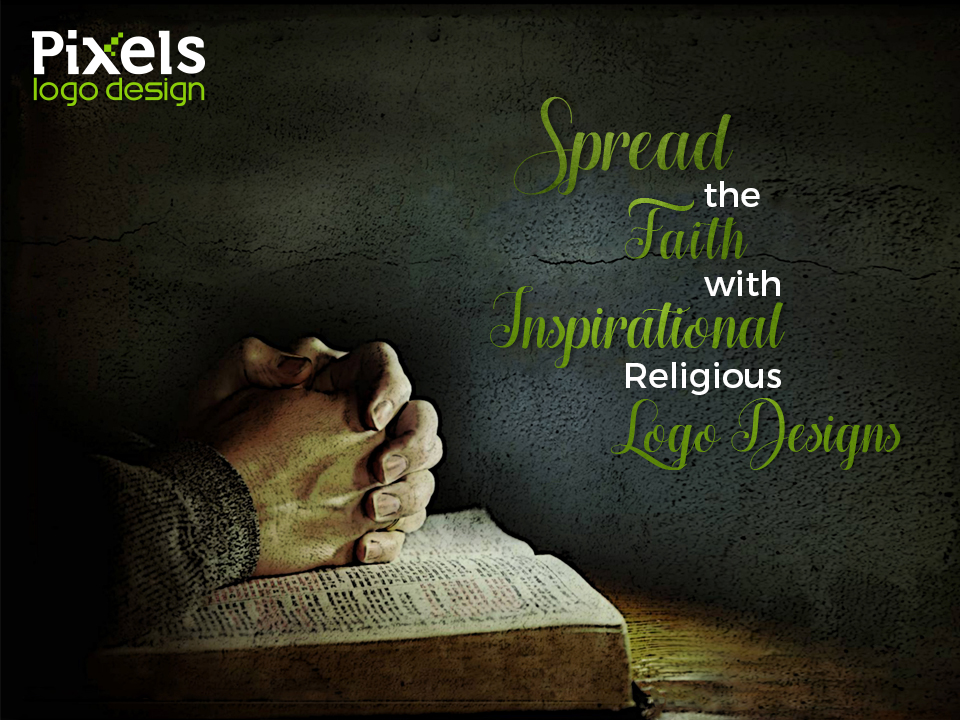 Logos are your brand ambassador. This statement holds true whether you are running a multi million empire or a local religious institution. Developing an effective logo allows you to instantly communicate your brand values and philosophy to your target audience and this is why more and more religious organizations are now focusing their efforts on branding. There are a number of elements that help shape a strong religious brand. The elements in the logo that help in communicating your brand message are text, graphics and typefaces.
Religious organizations have now started to realize the importance of branding. They have realized that branding their institution with a right logo design and values is important to get the message across to their congregate. But religious logo designs are different from any other kind of logo design as religion is very personal and dear to people. People tend to get really sensitive and invested which is why it is necessary that the designer tries his best to understand the religious values and the kind of message your religious organization wants to broadcast to its community. People identify with their religious institutions. It is basic human need to follow or belong to someone, they like to know that they a part of something greater than their existence and they like to believe in it blindly. That is what you are giving to the people through your religious logo design. You are giving them a symbol that they can relate to their faith. Though it’s tempting to go overboard and be creative while designing your religious logo, a much safer choice is to keep it classic, keep a relatable graphic that people of all ages will be able to associate with also. It is important to remember that your religious logo design becomes an identity that believers identify themselves with. You would be amazed to witness the kind of connection people build with a religious brand; your brand identity becomes responsible for people’s faith and belief. So create an emblem that inspires and evokes feelings of trust, peace, purity and tranquility. 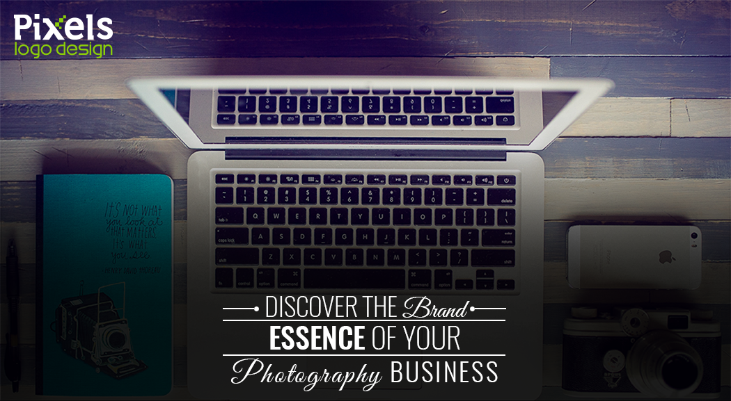 Photography is not just knowing how to click the ‘shoot’ button, there is a lot more that goes into it but unfortunately, market is filled with amateurs trying to pass off as professionals just because they have spent a few thousand bucks on equipment. If you are in the photography business, you’d know how frequent this situation is and how badly it has affected your photography business. Mainly because people are thinking of photography as a part-time job to make some extra cash and while it is a good thing, the actual photography professionals are suffering because of these novices. There is only one thing that can save the tanking business of the authentic photography professionals and that is a Strong Brand.
A strong brand presence will help you stand out, define your goals, highlight your specialties and most importantly make a unique identity that would help in distinguishing you as a separate identity in this otherwise cluttered industry. Developing a strong brand for your photography business is as important as having a professional camera nowadays. The cornerstone of any strong brand is a strong photography logo design but getting that perfect emblem that perfectly defines your style and your uniqueness is a daunting task. However, we took the time to jot down a few points that are essential in our opinion to frame a powerful brand. First and foremost, to develop a strong brand you need to know what your brand is. What is your brand personality, how do you want people to feel when they interact with your brand. It is much more than just an image and some text, the brand is an element that connects with your consumers on an emotional level. Go through our step by step process below to identify your brand personality. Step 1: Scrutinize Yourself: This may seem out of the blue. One would think I know what my brand is, I don’t need to ask myself anything and write it down but trust me when we tell you that it greatly helps. Ask some questions to yourself and be brutally honest while answering. 1. What purpose does your business serve? 2. Where do I see this business in next 5 years? 3. What are my services/products? 4. Who are my competitors? 5. What are they doing better? When you answer all these questions, you will know where you stand currently and thus, it’s the key to getting to know your brand better. Step 2: Word List: This is an activity that you can do yourself or you can get your employees to do it as well. Think about your photography logo design and then what you want your target consumers to feel when they see your photography logo design. Once you have at least 25-30 words on this list, single out the ones you think are most relevant to your brand, narrow this list down to 15 words and then build your brand around it. It will help you in capturing the essence of your brand. Step 3: Surveying your Market: There are some generic images that you’d see every other wedding businesses use, refrain from that. The worst thing you can do to your brand is to be some other popular brand’s copy and risk losing your identity forever. An in-depth market research will help you realize which elements you should incorporate in your photography logo design. By the end of these steps, you would have a far clearer idea of what you want your photography logo design to look like so go ahead, follow these steps and a picture perfect photography logo design. |
AuthorPixels Logo Design is a digital marketing agency based in California that offers branding solutions for small and large businesses worldwide. Founded in 2006, Archives
March 2017
Categories |
 RSS Feed
