Custom Logo Design Services in USA
Pixels Logo Design is a full-service digital agency based out of Walnut, California. It offers branding and digital marketing solutions to thousands of brands globally.
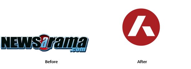 The Comic Reporting website is perhaps the oldest, which began in Summer of 1995 as a series of Internet Forum Postings and message boards by a fan, Mike Doran. Until late 1998 the collection of postings from the World Wide Web came to be found as Newsarama. The speed of reporting changed everything in comics, and thus newsarama became extremeley popular, giving Mike Doran the opportunity to get news faster than comic book publication – by word of mouth and via rumors. In the event of Mike Doran leaving Newsarama for a staff position at Marvel Comics, Matt Brady took over, who had written quite a lot for the newsarama website in the past. Doran happened to return later to Newsarama, neverhteless the old age comic book website has a new identity and it will take effect from today on their website. 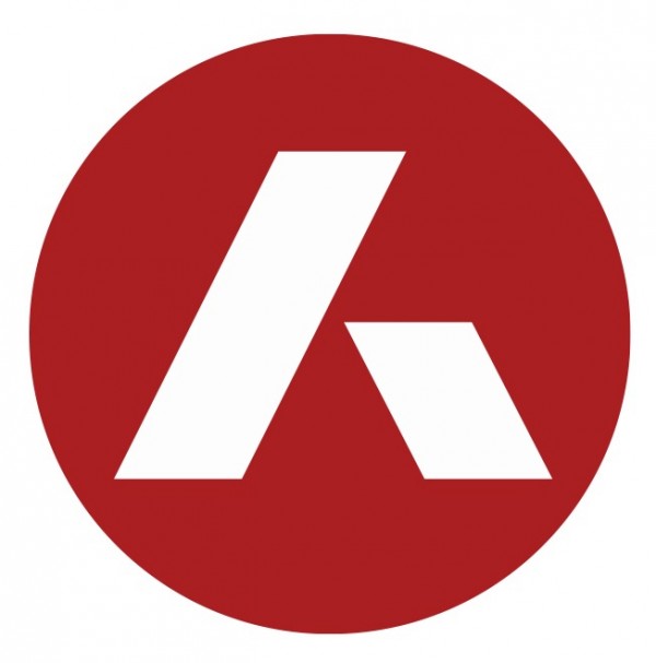 It looks like a banks logo design, stated our head of designer, with financial and geometrical lines scaled. Nevertheless, it could still be appealing to a lot of existing newsarama users.
Personally I remember following this website and still did. Not sure if everyone will be accustomed to the new logo, unless Newsarama has an addition to the existing identity, which could really juice it up.
0 Comments
The world is certainly not divided in to black and white and the most discussed intermediary grey ‘matter’ in between. There are lots of ways for a designer to gain inspiration for his next or upcoming project. There are times when a project would require a designer or the complete project house to wander about and experiment with different sketches as they walk by a park, a farmhouse or even a stretch of farm field. Bob Wolf the legendary designer for the Bank of America logo apparently made the discovery of financial ancestry through farm fields and thus the logo has fields illustrated on it.
Almost all designers have better intuitive luck with immediate contact with nature. Scientifically, nature has healing abilities and yes I mean wilderness, compared to that of a closed room with a stretch LCD or LED with a PlayStation 4 attached or an extremely addictive game like Warcraft constantly running in the subconscious of a designers mind – thus creating mental blocks for immediate ideas. It is the ability of the human mind that would not only tap in to nature and surrounding to draw inspiration but also be able to incorporate the same within an image and connect it immediately with the clients specialized product – and voila! A new logo, unique, incandescent, corresponsive and competitive is out marching the rest of your archived work. A few inspirational tips for a logo design below for the blocked mind: Stay Outside! Apart from the annual or half yearly vacations, try and spend time outside with an animal or pet. Sometimes, a designer would need all the psychological help he could get. At times a logo design is stuck in the subconscious to the extent that most of the designs have a bit of hint or touch from the previous ones. The best foot forward is to take opposite projects, from light to darkness – all will help. The more the mind is exposed to nature the better. You may be working for a specific industry, for example and I.T organization, the only communicative signals you receive are about wires, and waves of signals. The trend however is completely different. Subjecting yourself to a monotonous design platform could instill the rigidity of not moving to other projects – thus a comfort zone you wouldn’t want to leave. The next vocational trip you make, you must not only have a pencil and a notebook, which is the usual, but also have the vision to creativity and uniqueness and the positivity for different organizational identities. Understand Geometry through Structures The need to develop designs and identities every now and then would leave your brain exhausted, apart from images that pertain to only graphics and logos and intelligent designing – start looking at ancient, historical monuments. These hold the key to geometrical shapes within a logo. Let’s ask ourselves – as designer what is the first thing that would come to your mind when looking at a painting or a logo? What background is that? Vector? Pixels? Quality? Color Ratio? Dimension? Imagery – and the list would go on till you’d probably remember you still have the keys hanging on the car you parked outside! The purpose of going out and seeing others work is YES to criticize – just so that you have a different feel altogether, a different opinion, something completely different from what you are doing in your daily lives! The best designers of the world would find their kids drawings to be more interactive than their own, not because it’s raw and natural! But because it’s from the heart! Every designer needs a break, inspirational images or opposite images and paintings other than the old projects imagery, could always help to clean the slate! The term construction comes from ‘construct’ or ‘construe’ which is a Latin word where ‘Con’ is defined to be together and ‘struere’ meaning pile or build. Nevertheless, a construction logo design isn’t exactly a piece of cake for logo generators and graphic designers in today’s times. There are a number of reasons why competition has crumbled the percentage of exclusivity. Plus there are various articles spreading a gloomy picture over images and concepts already utilized – instead of publishing the originations of versatile designs. There is no development without proper encouragement in any field. Thus the ‘material’ in the times we live in always redirects us to perceive the lack of exclusivity, quality and extreme talent.
Diamond in the Dirt – Find Talent An identity cannot be made out of brick walls, although the idea is really amazing – to be setup with brick walls, like the Danube Construction Company and its Logo. But literally, the competition is extremely thick and a copy wouldn’t last a day. Hence maintaining that uniqueness in a construction logo design isn’t an easy accomplishment anymore. What matters the most is the ‘raw’ talent out there, still unearthed. If a design house or an individual designer is about to bring about a perfect image with a hint of the organizations specialization, along with abstract colors, or different color gradients with exclusivity to your front door, then that design house or individual designer is a keeper. Most dedicated and experienced designers work extremely hard to maintain the uniqueness within any logo. But when it comes to a design – there is immense out of the box thought process and intuition that would come in to play. As an organization you may choose to extend your search online for an economical yet unique logo. The possibility might I add is a 100% that you may just find that amazing logo designer who could within no time whip up an exclusive construction logo design. The question is the time taken to find this diamond in the dirt and also the gamble of sacrificing precious timescales. All in all, a designer would have thorough research completed in order to assemble and incorporate the company’s vision, exclusivity, communicable typeface for font and the choice wouldn’t limit the organization – instead it would only aid for the design to be spread across different accessories of multiple types. Not every designer is a great designer. Every designer has their own distinct qualities but is there some roadmap or a formula for being a great designer. Many people think that creativity and greatness is an innate quality while some think that creativity is a learned behavior. We believe that it is an individual’s attitude and perspective that determines his creativity, professionalism and scope for greatness.
After being in the business for many years, I have come across a lot of logo designers and graphic designers. In my observation, all the successful and most creative ones have some traits in common so here is a rundown of the few great qualities I have witnessed in every professional logo designer. 1 – Willing to Learn: There is a very fine line between confidence and arrogance and for many this line can be a blur. Many designers are not receptive to the new information and they don’t like to hear that something is done better when done different from the way they were taught. They lose their cool and reject any new information claiming what they know and do is indeed the best and that’s when the downfall of a designer starts. The logo designing field is constantly evolving with new trends and techniques coming out every now and then and the ones who are successful are teachable and open to learning. 2 – Being Inspired: Another thing that I have noticed in all professional logo designers is that they are always inspired. They dedicate at least 30 minutes to looking through the websites that offer design inspiration and latest trends, this helps you learn and exposes you to what’s going on in the design world. If not the latest trends, they find inspiration in everyday life and things which makes them great and creative. 3 – Taking Criticism Constructively: Norman Vincent Peale once said, “The trouble with most of us is that we’d rather be ruined by praise than saved by criticism”. This is so true as many people don’t take criticism well. It is very important for a designer to understand that criticism is only another person’s opinion that’s meant to make you better. It is nothing personal and being able to take criticism constructively is one of the qualities of a professional logo designer. 4 – Adaptability: Every logo designer has their own personal distinct style and it is probably what sets you apart from others but a good designer should be able to adapt to its client’s requirements. Being flexible and adjusting your designing style to be in line with the client’s requirements is the mark of a true professional logo designer. 5 – Pushing the Envelope: Everyday logo designers are faced with situations where they have to push outside their comfort zones. They’ll be asked to do something they’ve never done before and that’s where a true professional logo designer shines. Allowing yourself to experiment, learn new things and taking in the knowledge and transforming it into something creative is a mark of a true designer extraordinaire so push your boundaries and be great! So if you are a graphic designer and don’t possess these qualities already, you know where you are going wrong so start today and be great! A great company and a great logo design have one thing in common - They both bear same values and vision. Yes, the logo of your company is a mirror image of your plans whether short-term or long-term, it is the image that represents your company’s past, present and future. Similarly, a successful fast food restaurant is much more than a well-designed dine-in and scrumptious meal, behind the victory is a secret of well-versed messages. Messages that have been conveyed to the target market to attract and convince them to give their product a try. These messages are mostly communicated well through a logo design that is so powerful that it becomes an image of inspiration for the organizations existing and set to form in future. A good logo is a well thought out combo of right amount of content, artwork, color and marketing strategy. Each element is crucial to the success of an organization’s visual success. A Fast food logo design will work if it’s every detail expresses your company’s real idea and answers all the basic questions that first pop up in your clientele’s mind when introduced to your logo design. These questions are more likely to involve interrogations like, what do you do? What do you offer? How do you differ from others? Is your food worth a try? – A remarkable Fast Food logo design has the potential to deliver information very clearly and concisely. If your Fast food logo design is a success then there is a greater chance that the artwork and graphics used in it makes your products seem tempting, it includes colors used in it provoke the right emotions in the right clientele and contains content that inspired them or is imprinted to their mind forever. Here are a few examples that express spot-on logo designs with the right strategy: 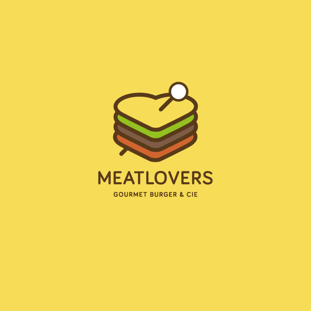 This Meatlovers Gourmet Burger & Cie logo shows a literal image of a sandwich forming a shape of heart an image that remains minimalist yet modern at the same time. It is a perfect example of how a logo can be fun and unexpected. It excites your taste buds and proves to be unique. 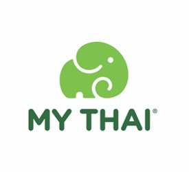 My Thai successfully targets the right clientele by going green. The image and color choice becomes a perfect decision for the company to please customers that have true love for Thai Cuisine.
|
AuthorPixels Logo Design is a digital marketing agency based in California that offers branding solutions for small and large businesses worldwide. Founded in 2006, Archives
March 2017
Categories |
 RSS Feed
