Custom Logo Design Services in USA
Pixels Logo Design is a full-service digital agency based out of Walnut, California. It offers branding and digital marketing solutions to thousands of brands globally.
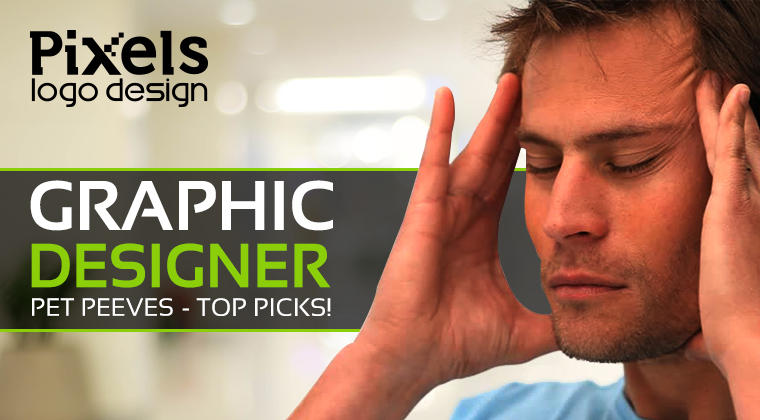 We all got pet peeves. I have a few of those myself like People that chew with their mouth open, the ones that tell you to calm down when you are angry, the ones that say the word “literally” in literally every sentence. Let me tell you all a little something, no one in the world history has ever calmed down by being told to calm down so just quit it! However, there are always these little things that drive you over the edge and make you pretty angry. Today we are discussing the pet peeves of graphic designers. Graphic Designers are usually very strong people, they are like sponges, they absorb all the criticism, rudeness, harsh comments, unbelievable client demands and still pull off an amazing design but there are some things that drive these nice souls over the edge as well. So here is a rundown of graphic designer’s pet peeves as told by designers themselves:
1. Comic Sans MS: This single font has the power to annoy the entire graphic designer community. I mean if it is used on a birthday party flyer made by a 5-year-old, I’d understand but this font is definitely not meant to be used for professional communication. You cannot use it for doctor’s office sign nor for a website. It gives an amateur childish look; only go for it if unprofessional is the look you are going for. In fact, even then don’t go for it! 2. The Loner: The one word that gets left behind all alone in the whole line is what I refer to as the loner. Not only does this loner look alone and sad, it also disrupts the reading process. Only a single word eating up an entire line of space draws unnecessary attention. Graphic designers always adjust the layout and text to avoid such loners. 3. Curlz MT: Again, a font good for a 13year old’s Bar Mitzvah invitation but otherwise? Not so much! It is annoying, hard to read and unprofessional. Hopefully, they are enough reasons for you to not go for it! 4. Whitespace: I sincerely believe that Whitespace is not given enough credit, one that it definitely deserves. I personally hate the ads where there is no space for the words to breathe. Everything is so cluttered and so much information that your eye has no idea where to look. Use the whitespace wisely to communicate your message. It’s hard to maintain your focus on one thing when you’ve got so many things going on. 5. Mom/Friend/Niece/Nephew/Dog said: Everyone likes to get feedback from their loved ones, graphic designers understand that but it gets annoying when that feedback turns into a lesson for the designer. You didn’t hire your mom/friend/sister etc. to design for you. You contacted a professional graphic designer so trust in our ability to deliver a design that would wow you. If you are guilty of any of the above, don’t worry! It’s perfectly fine. After all, it’s all about personal expression. Design what looks best to you!
0 Comments
Leave a Reply. |
AuthorPixels Logo Design is a digital marketing agency based in California that offers branding solutions for small and large businesses worldwide. Founded in 2006, Archives
March 2017
Categories |
 RSS Feed
