Custom Logo Design Services in USA
Pixels Logo Design is a full-service digital agency based out of Walnut, California. It offers branding and digital marketing solutions to thousands of brands globally.
|
Your business logo is one thing that you absolutely can’t get wrong. Since it singlehandedly has the responsibility to represent your brand, you need to select an emblem that’s perfectly in line with your brand values. However, the situation is ten times more crucial if the business is re-branding itself. Us consumers are generally not very crazy about change, we don’t accept changes that well, especially when it comes to our favorite brands. In the world where everything is changing so quickly, we want our favorites to remain a constant and we absolutely reject any changes to them unless they have really outdone themselves. Today we look back on some of these corporate logos that re-branded themselves by changing their business logo in the past year: 1. Lenovo: Lenovo is a Chinese tech company that changed its business logo. The new corporate logo is meant to communicate a brand that spans different categories and never stands still, however, the new logo was not well received by the consumers with many calling the logo boring. 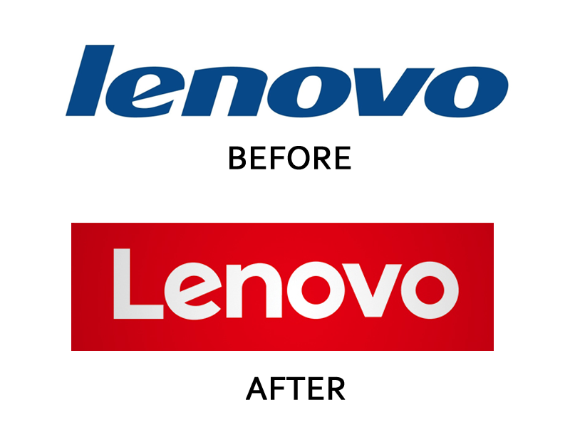 2. Verizon: Verizon introduced its new corporate logo after it acquired AOL however neither the design community nor the customers were very receptive towards the new logo with many calling it “Basic”. The signature red checkmark which has become synonymous with Verizon’s brand has been de-emphasized and pushed in the corner in the new design. The straighter font choice made the customers feel as if the brand has lost its spark. 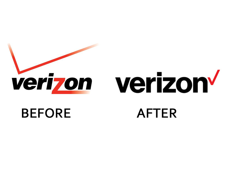 3. Merck Pharma: Merck has the title of being the oldest pharmaceutical company in the world. However, its new logo shocked everyone as it doesn’t sit well with their brand image. It is an almost cartoonish looking logotype logo which seems to be filled with green slimy color. One thing is for certain, though, this definitely doesn’t look like the logo of an oldest pharmaceutical company. It looks more like a children’s video game logo. 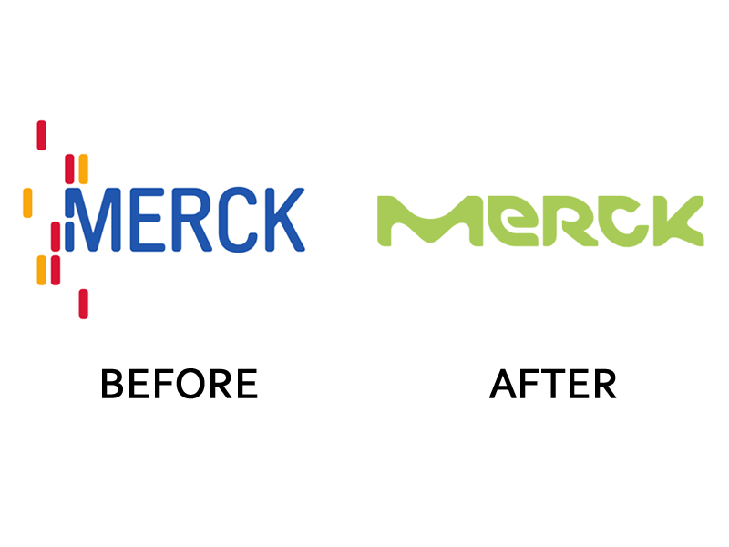 4. Daimler: Daimler is the parent company of Mercedes which recently updated its look which has received mixed reactions from its audience. The new logo has a metallic tinge that looks a little cheap than classy. 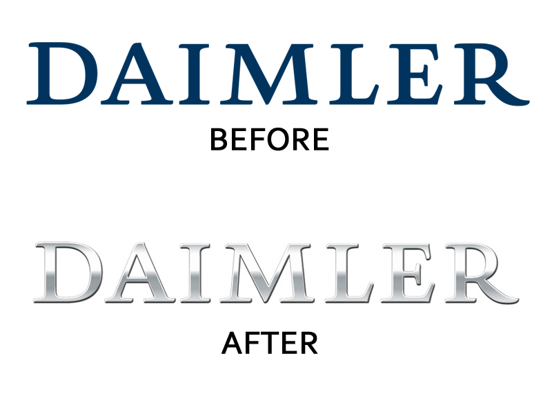 These are some of the worst business logo fails of 2015. Read and take note to avoid making mistakes that these brands made while re-branding.
0 Comments
Leave a Reply. |
AuthorPixels Logo Design is a digital marketing agency based in California that offers branding solutions for small and large businesses worldwide. Founded in 2006, Archives
March 2017
Categories |
 RSS Feed
